Source
Supabase live template
Delivery
Sent email
Last sent May 9, 2026
Updated
May 1, 2026
Visuals
4 image assets
Version 2. rewrote Day 8 for usable image generation guidance and added three branded visuals
Main Context
AI Orientation
Day 8: Image generation, style consistency, and staying out of copyright trouble
Day 8: Generate images people can actually use
What you'll see today:
- What image generation is good at right now
- Why style consistency matters more than one flashy prompt
- The difference between inspiration and copying
- How to direct an image model more clearly
- Your action: generate a useful image, not just a weird one
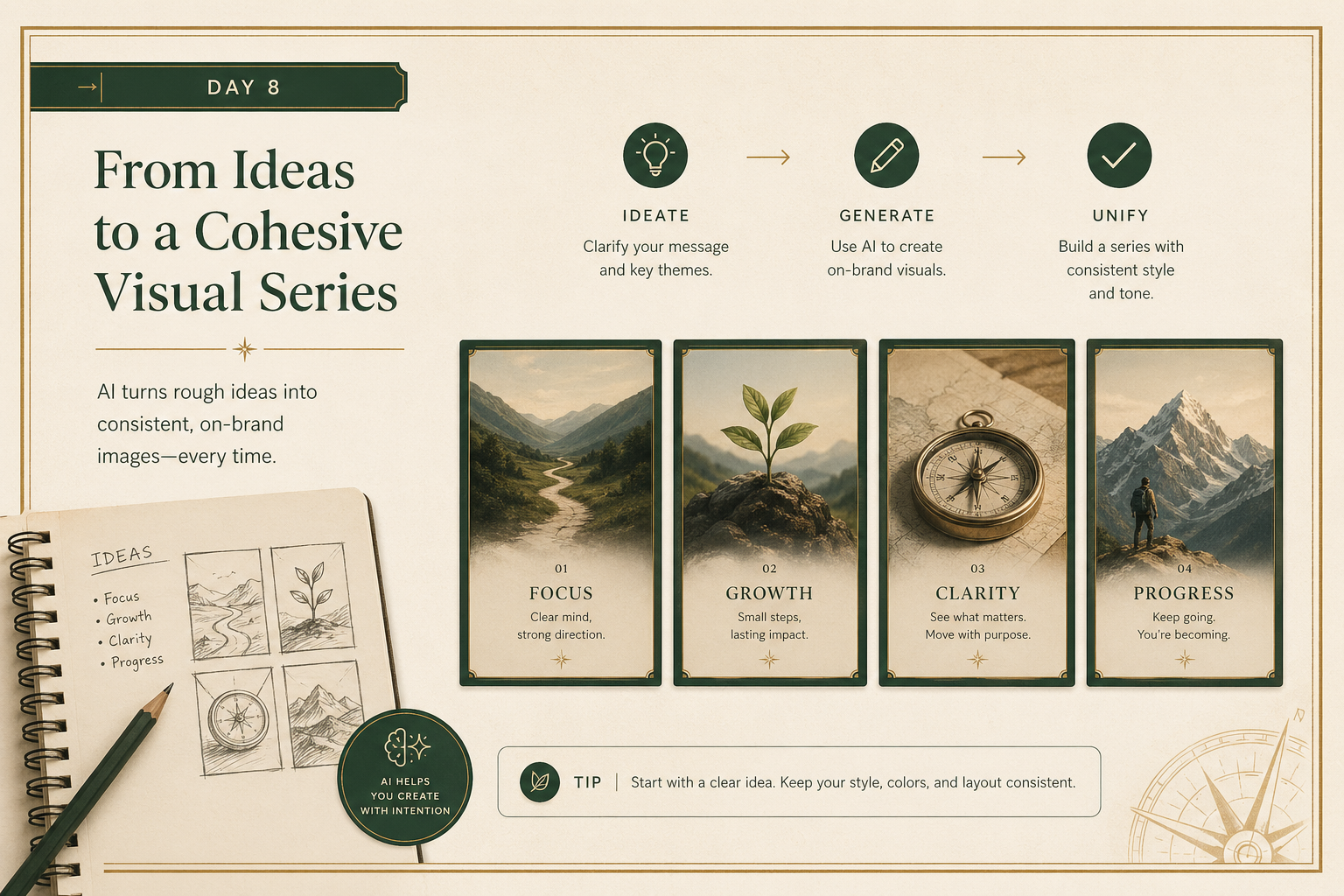
Image generation is one of the fastest ways to feel the magic of modern AI.
You type a prompt, and something appears.
That is exciting.
But beginners often stop at novelty.
The more useful move is to ask:
Can this image actually be used?
Today is about moving from “fun experiment” to “usable visual.”
1) One good image is less valuable than a consistent set
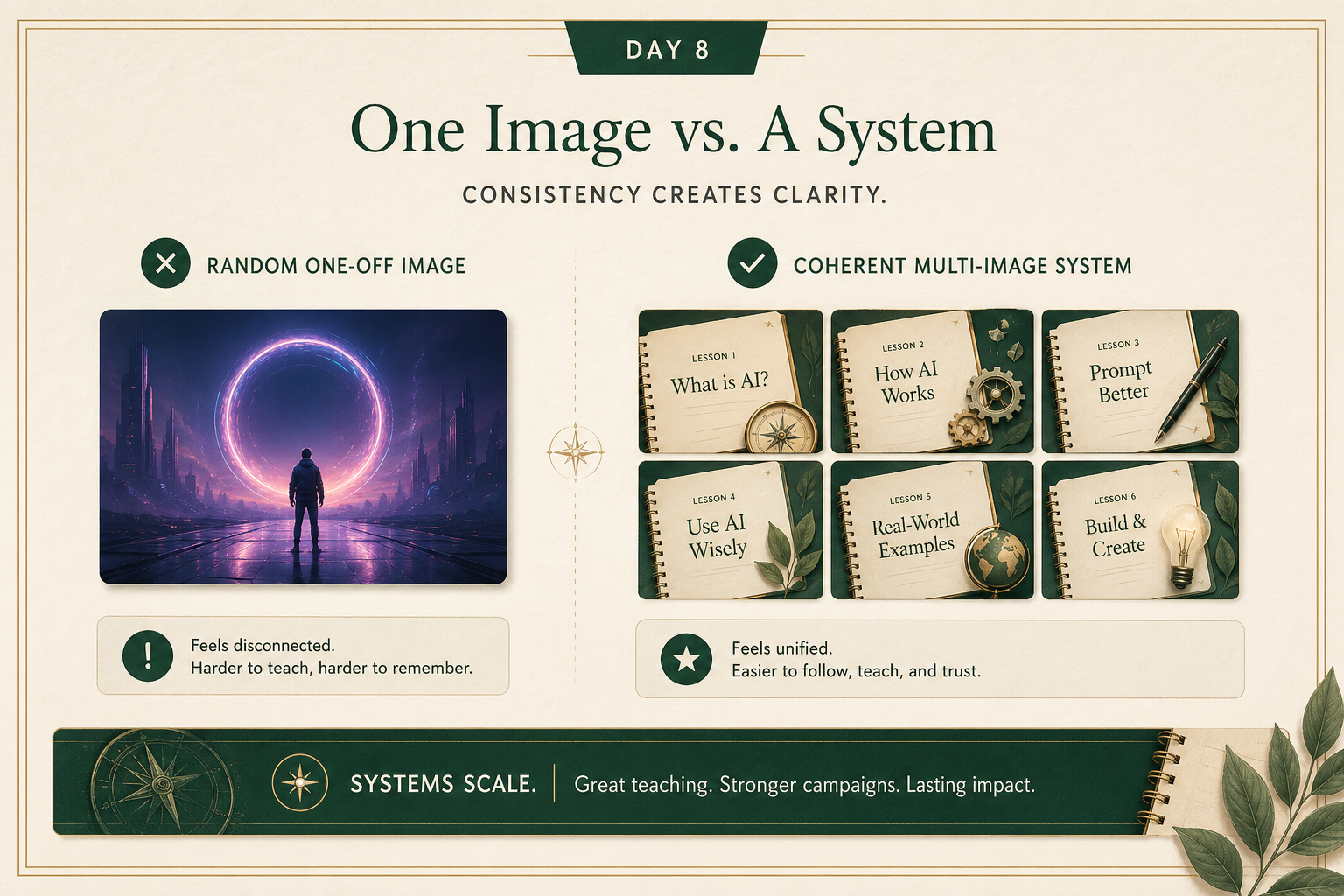
A lot of people generate one striking image and think the job is done.
But in real work, consistency matters more:
- a set of slides
- a lesson series
- social graphics
- product mockups
- campaign visuals
The question becomes:
can you make the second image feel like it belongs with the first?
That usually means being clearer about:
- composition
- palette
- mood
- level of realism
- typography style
- framing
A useful beginner upgrade is to stop prompting from scratch every time.
Create a reusable style block and keep using it.
2) Inspiration is fine. Copying too closely is not.
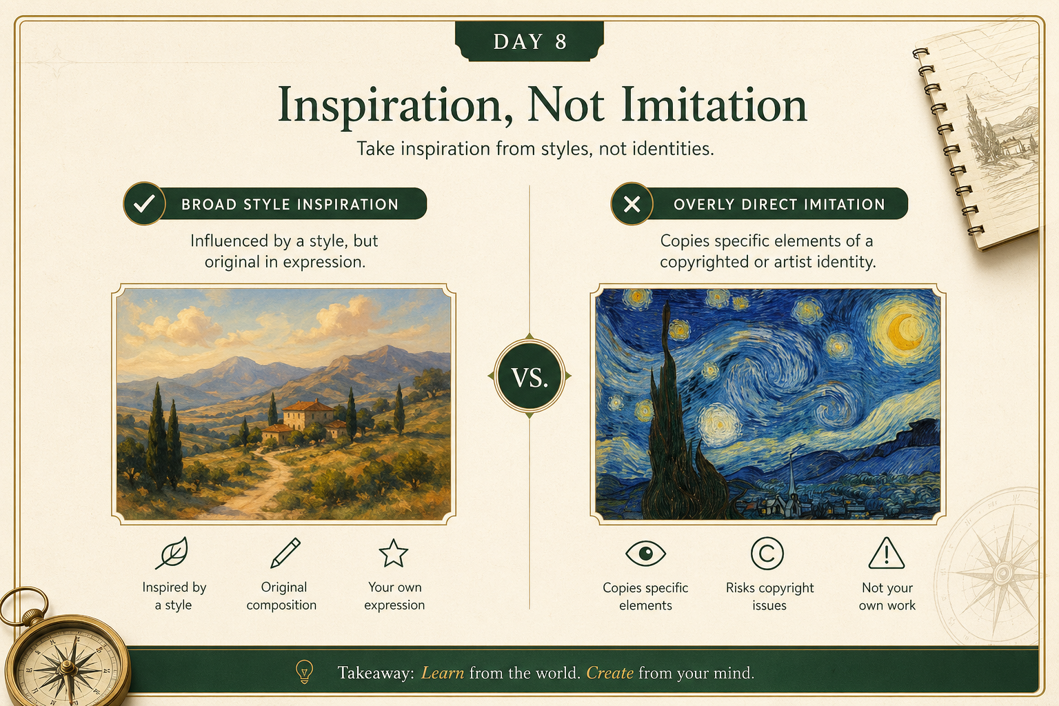
There is a simple judgment line here.
Safer:
- “editorial illustration”
- “clean product photo style”
- “vintage botanical poster feel”
- “modern presentation graphic with muted green palette”
Riskier:
- asking for a direct replica of a living artist’s exact style
- recreating a recognizable copyrighted character or brand asset
- making something that is basically a substitute for a protected original
The practical rule:
borrow broad visual language, not protected identity.
3) Better prompts usually describe the result, not just the subject
Weak prompt:
“Make me a picture of a futuristic office.”
Stronger prompt:
“Create a clean editorial-style image of a modern office using warm natural light, neutral tones, subtle green accents, and a calm premium layout. Avoid sci-fi clichés. Make it feel practical and believable.”
What improved?
- clearer style
- clearer mood
- clearer exclusions
- clearer use case
The best image prompts usually say:
- what it is
- what it should feel like
- what it should avoid
- where it will be used
Your action for today
Generate one image for a real use case.
Pick something like:
- a lesson graphic
- a presentation visual
- a website hero image
- a product mockup
- a social post image
Reply with:
- the use case
- the exact prompt you used
- the image result, or a description of what happened
- what felt off or what worked well
I’ll tell you:
- whether the prompt was specific enough
- how to improve consistency
- whether the request stayed on the safe side of copying